
Rose Brickley - Work Samples
SNNYC Little Book of Network Norms
November 2022
The Sterling Network Fellows are a group of NYC systems leaders with an intentional focus on racial equity and economic mobility. The goal of this project for the Sterling Network NYC, was to create a small (5.5”x4.25”), spiral bound booklet that could serve as a handy guide of the group’s collectively developed tools and best practices. Besides the content, the group also provided the idea of stars or constellations as a design theme. I created this “Little Book” that had the polished nature of a reference guide, while also embodying the fun, dynamic vibe of the group. I created a retro constellation and space theme through simple illustrations, color scheme and typefaces. I also added small details like a place to write your name on the cover, and note pages in the back to make the booklet more engaging and to signify the evolving nature of the content. The client reported that the booklets were a huge hit when distributed at the group’s recent gathering and said they would be “an anchoring resource for the network going forward.”

Robert Sterling Clark Foundation Participant Booklets
October 2022


This client was looking to create two booklets for an upcoming gathering that would include a basic introduction to each of the participants and their organizations. The gathering included nonprofit leaders from three different cohorts: the Learning Community (which would have their own booklet, but also be included in the larger booklet), the Executive Directors, and the Fieldbuilders. The client wanted the larger booklet to be easy to navigate, but did not want any type of hierarchical division between the cohorts. I solved this layout challenge by placing all participants in one section, ordered alphabetically by first name and labeled with their corresponding cohort. To ensure ease of use for the reader, I also created a Table of Contents and Participant Index to easily find each participant by name or group. The booklets were distributed in print and digitally. I added interactive features to the digital versions, like links to external contact information or websites and content links within the file itself. Despite the great deal of content along with strict brand guidelines from the organization, I was able to achieve the goal in creating two booklets that presented the content in a simple, easy-to-read, and professional format.
Harbor Springs Festival of the Book 2022 Festival Program
September 2022
HSFOTB gathers authors, illustrators and readers from multiple genres for a multi-day Festival in northern Michigan annually. I created the Festival Program for 2022 which included a full Festival schedule, session descriptions, map of the venues, presenter & moderator bios, a list of donors, advertisements and more. I started by creating a fresh “look” for 2022 that stayed true to the Festival’s branding, but incorporated some more modern elements like gradients, overlapping shapes and shadows. For the cover, I created an illustration of a book, open to the scene of downtown Harbor Springs as the centerpiece of the Program. I used a consistent style throughout for a clean and straight-forward presentation. However, I also created section-specific layouts, so each section could stand out from the previous. One challenge was simply fitting all of the content in 44 pages in a way that wouldn’t overwhelm the reader with a wall of text. This was achieved with efficient and unique layouts that involved columns, photos, graphics and colors and made use of the entire page.
[Previous year’s program’s, which I also designed, can be viewed here]

Harbor Springs Festival of the Book 2022 Festival Summary
November 2022

This is a yearly publication sent to donors and supporters of the Festival. The goal is to give a brief overview of the Festival and also call out the highlights from this year as well as the positive impact the Festival has on the community. This year, the Summary was distributed digitally and in print. The print version was finished as a tri-fold brochure with a very fun perforated “Save the Date” bookmark that could be torn off, and the digital version was adapted for screen viewing. The style was consistent with the 2022 Festival Program. I used clear simple graphics to communicate the data on participation and impact. Between all of the text, I incorporated lots of engaging photographs from the event as well as quotes from Presenters and Attendees to help tell the story of this year’s Festival.
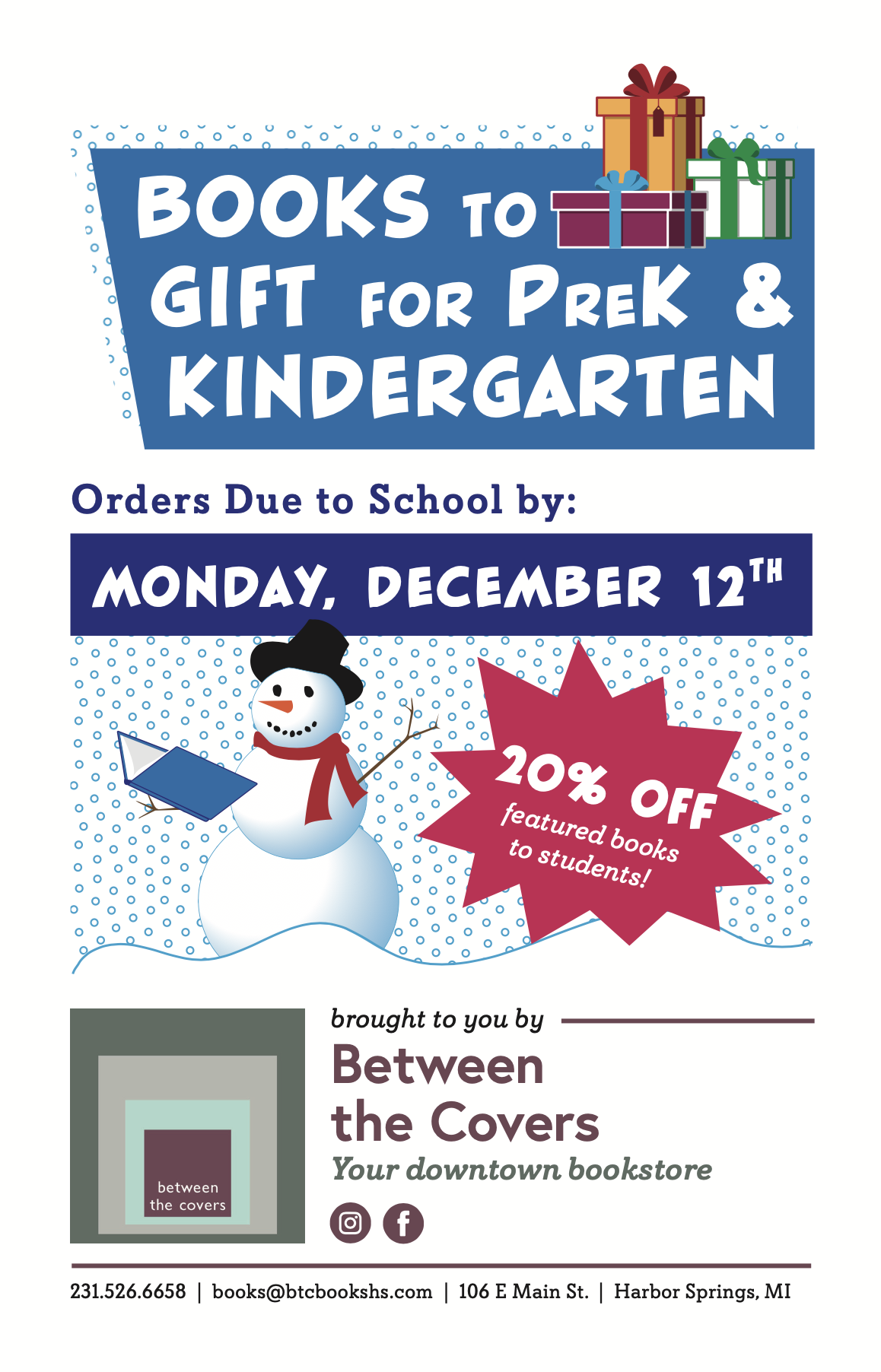
Between the Covers Anti-Amazon Postcard
June 2022
Between the Covers is a small indie bookstore that was frustrated with customers’ confusion over why books in their store cost more than they did on Amazon. They asked me to create a postcard that they could easily handout at the store to help illustrate why to buy from them instead of Amazon. They had a lot of content and ideas they wanted to communicate so the challenge was to distill all of that into something engaging and eye-catching enough to get someone to read and remember it. I used a mix of tongue-in-cheek illustrations and color schemes with infographics and bulleted lists to get the point across. The postcard was a huge hit and they asked for me to edit and re-format the work for an Instagram post and for a local advertisement as well.
*I recommend viewing all PDFs in Adobe Reader to avoid unintended display errors that may be caused by different browser settings or configurations.
Other Notable Recent Projects:


Contact Me!
Get in touch if you have questions or would like to talk about your project. Thanks!
-Rose